Desktop Presentation
Desktop presentation is the user interface an end user will use to interact with SSO enabled applications. Each of the Desktops becomes a launch pad for applications that the organization has defined for the user, and each presents a unique experience for customizing possible interactions. Below are the supported types of desktops for the ExactAccess solution.
Toolbar Desktop
Note
To make use of the Toolbar Desktop, you must register the DESKTOP_SERVER.XML file using the ExactAccess Administrator. If this is an upgrade from 4.10, you must register the DESKTOP_SERVER.XML from 4.11 or higher for the work space and expanded favorites to function.
Customized Display Name
When creating or registering a connector or application, it is possible to alter how the ExactAccess desktop displays the name.
Short|Long Name specified
See Create New Snap Application for adding an application link (The Short|Long entry applies to the "Enter Display Name" field.
The NAME property of the XML file specifies both the short name, and the long name separated by the pipe character |
Short|Long Name specified
See Application Registration for importing an XML that has been modified with these properties
Touchscreen support with drag and drop enhancements
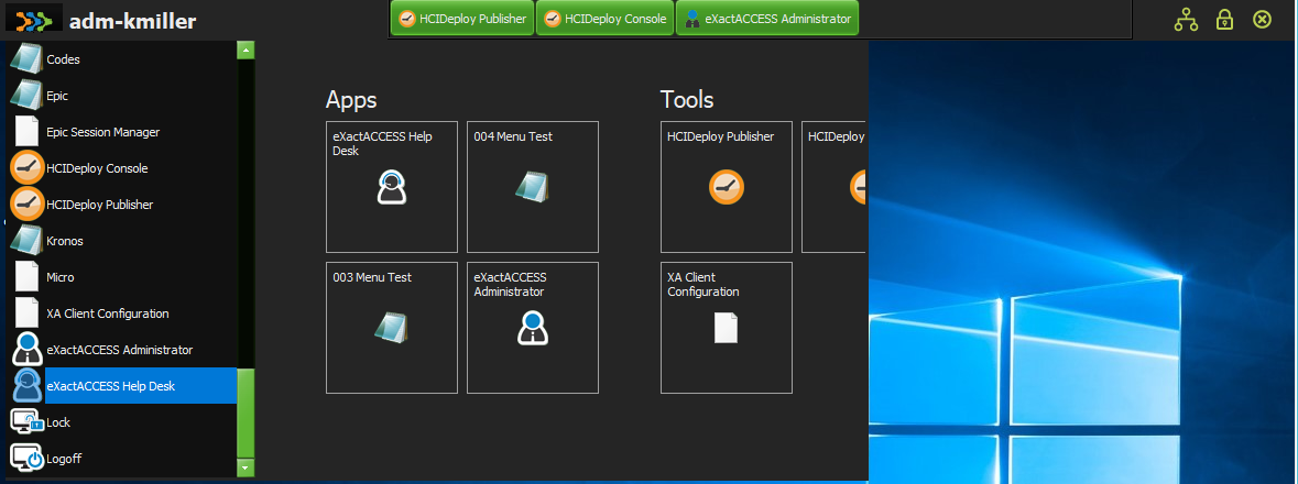
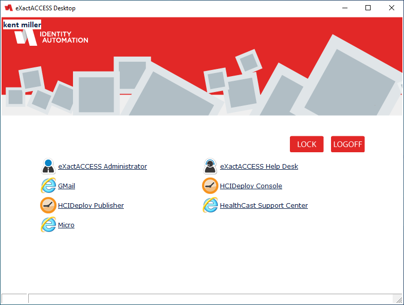
The toolbar desktop is a compact application display and launch pad for SSO enabled applications. It will occupy the opposite edge of the standard Windows Start bar(e.g. if Windows start bar is at the bottom, the toolbar will be at the top of the screen.
Tip
If the Windows start bar is on either side of the screen, or at the top of the screen, then the XA toolbar will appear at the bottom of the screen.
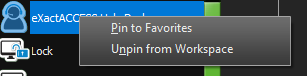
Items in the scrolling menu may now be dragged and dropped onto either the favorites toolbar location, or the work space area to "pin" these items for faster access.
Tip
It is recommended that the most used applications be pinned as favorites for single click access (the user may pin as many items as there is display space for use).
Less frequently used items can be pinned to the work space areas so that the menu does not need to be scrolled to locate a needed application.
The user can create new groups by dragging items from a group to the area between groups (or to the right of an existing group).
Right click on the work space to allow for renaming the groups.
The favorites area is displayed when the menu is not active, giving single click access to pinned applications, and the scrolling menu with the work space is displayed when the menu button in the upper left is depressed.
At the far right, there are button images that may be customized (see Changing button appearance to match style below) - they are from left to right:
The Internet/Portal button
The ExactAccess Lock button
The ExactAccess Logoff button
 |
Expanded favorites and work-space pinning
Required
If you are upgrading from a previous version (prior to 4.11), you must register the DESKTOP_SERVER.XML file from this version for the work space and expanded favorites to function.
Note: The DESKTOP_SERVER.XML file must be registered for first time installations. See ExactAccess Administrator for importing the XML settings.
If a touch screen is attached to the workstation, the borders around the work-space are automatically enlarged to allow for the finger to grab and resize the work space area.
The work space area can be swiped from right to left to scroll the display when there are additional groups or many icons on the display surface.
The work space may also be collapsed to allow for using only the scrolling menu if desired. A button appears to allow quick re-display of the work space area.
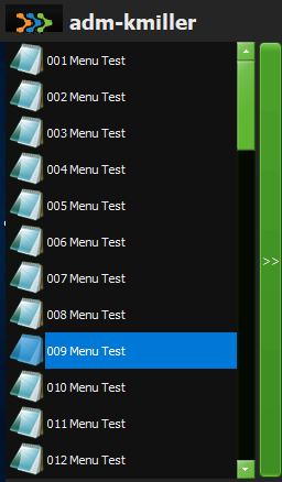
With the introduction of the work space feature, the favorites menu now allows for more than fifteen pinned items. This allows for additional favorites and work spaces when using a high resolution (3K, 4k or higher DPI) display device.
A right click, context menu also allows for pinning and unpinning items for both the favorites and the work space areas
 |
User Customization
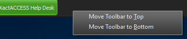
End users may now choose where the toolbar appears on the screen edge, either the top or bottom. Right click on the toolbar (in a location other than on a favorite button) to receive the context menu to choose the location.
Display Examples
This is a small sampling of the styles that are available to be applied to the toolbar. They are located in:
C:\Program Files (x86)\Common Files\HealthCast\themes
See Setting a Style/Theme below for configuring a particular look.
RubyGraphite.vsf - this is the default style applied during installation.
 |
HCGreen.vsf
 |
Amakrits.vsf
 |
AmethystKamri.vsf
 |
Copper.vsf
 |
Diamond.vsf
 |
Emerald.vsf
 |
Glow.vsf
 |
MetropolisUIBlue.vsf
 |
Radiant.vsf
 |
Windows10.vsf
 |
Windows10Blue.vsf
 |
Windows10Dark.vsf
 |
Configuration
Enable Hints
To enable application launch path hints, enable the following:
HKLM\Software\HealthCast\ExactAccess\Override
TBDesktopFavoritesHintEnabled: reg_dword = 1
To set a particular style or theme for display:
HKLM\Software\HealthCast\ExactAccess\Display
DesktopStyle: reg_sz = "<a valid style file name or full path and file name, including .VSF extension>"
Tip
For a full list of available styles, look in the following installation folder:
C:\Program Files (x86)\Common Files\HealthCast\themes
Enabling the Internet button
To enable the internet button, you must have a URL set in the following registry key:
HKLM\Software\HealthCast\ExactAccess\Display
TBDeskInternetButtonURL: reg_sz = "<a valid complete URL with http:// or https:// prefix to a site>"
There are three images that can be customized to match the color scheme of a chosen style or theme. These files are located in the ExactAccess installation directory. To customize the appearance of these items, replace the files with new images that match the chosen style.
C:\Program Files (x86)\HealthCast\ExactAccess
TBInternet.png - the internet/intranet icon image used to launch the default web site to the configured URL.
TBLock.png - the system/XA Lock image used to lock the session.
TBLogoff.png - the system Logoff image used to logoff the session.
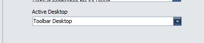
Enabling Desktop with Configuration tool
Using the configuration tool, select the Operation tab, then find the Active Desktop Drop down - choose the "Toolbar Desktop" option.
 |
Enabling Desktop with registry settings
HKLM\Software\HealthCast\ExactAccess\XAServerManager
Desktop: reg_sz = "XATBDesk.clsXATBDesk"
HKLM\Software\HealthCast\ExactAccess\Override
TBDeskCreatesXAMenu: reg_dword = 0
Hint
The following registry settings may not exist and will need to be created manually.
Disable Invalid Links View with registry settings
HKLM\Software\HealthCast\ExactAccess\Override
TBMenuShowInvalidLinks: reg_dword = 0
Defining Custom Icons for Applications
Associate a specific icon with a specific Connector
After enabling icons with the XA desktop, you may notice that the icons displayed with the Connector do not match the application. The procedure below details how to set a custom icon for each Connector so that the underlying application is accurately represented.
Extract or otherwise create an icon (.ICO) file representing the application.
Name the icon file the same name as the Connector executable and place it in the same directory as the Connector.
This can be done by including the icon as an HCIDeploy item for the Connector
Example:
If the Connector name is xaInvision.exe, name the icon xaInvision.ico and place it in the same directory as xaInvision.exe. After the icon is available in the directory, this icon will override the default Connector icon. Refresh the desktop using the "Refresh Desktop" pop-up menu item on the ExactAccess User Context Manager in the system tray.
Published application instructions for icons
For published applications that use the generic launcher, a slightly different method must be employed. Because the launcher name is always the same, no matter what application is being launched, simply placing a new icon for the launcher will not properly identify the application being launched. Each link on the desktop that references the launcher will be followed by an icon specification.
Example:
xaLauncher.exe "SSO Application" is shown on the status when hovering over the published Application Connector link.
Put the following file (xaApp.ico) in the same directory as xaLauncher.exe
(this will typically be C:\Program Files\HealthCast\ExactAccess)
This file will then override any custom icon (xaLauncher.ico) , and will override the default icon provided in the executable (xaLauncher.exe).
The application launcher for the published "SSO Application" application then needs to be registered with the additional command line parameter "/ICON:xaApp.ico"
Published application instructions for icons when using Citrix PNAgent
For published applications that directly use the PNAgent.exe, a slightly different method must be employed. Because the application name is always the same (pnagent.exe), no matter what application is being launched, and due to permission restrictions on the Citrix PNAgent directory, simply placing a new icon in the PNAgent directory is not an option. As with the launcher, each link on the desktop that references PNAgent will be followed by a an icon specification. However, the default location of the icon must be specified.
Example:
PNAgent.exe /QLaunch "SSO Application" is shown on the status when hovering over the published Application link.
Put the following file (xaApp.ico) in the ExactAccess Directory
(this will typically be C:\Program Files\HealthCast\ExactAccess)
This file will then override any custom icon (PNAgent.ico) , and will override the default icon provided in the executable (PNAgent.exe).
The application launcher for the published "SSO Application" application then needs to be registered with the additional command line parameter "/ICON:%XAUCM%xaApp.ico"
The path to the icon may be specified by using environment variables (specified between the % symbols), or may use the special %XAUCM% designation to mean the XA install path.
Note
See the Application Registration section of the Administrator Tool Guide for information on how to register a Connector.
See Specifying Command Line Parameters for information on how to modify the registration XML file to include command line parameters
Internal
To automatically have the XA Toolbar Desktop application to launch and close when a user logs in and logs off, the following settings can be configured.
Note
These are the default values for 4.11+ and should not need to be user/admin edited.
HKLM\Software\HealthCast\ExactAccess\Override
AutoLaunchTBDesktop: reg_dword = 1
HKLM\Software\HealthCast\ExactAccess\Override
StopTBDOnQuit: reg_dword = 1
Hidden Gem
Alt-Q functionality can be enabled for the toolbar to make switching styles and testing easier, but should not be enabled for users by default.
HKLM\Software\HealthCast\ExactAccess\Override
TBDesktopQuitButtonEnabled: reg_dword = 1
To use the feature once enabled, click somewhere on the toolbar to ensure it is the active window. Then, press Alt-Q.
Application Desktop
Features
The application desktop is an application window display and launch pad for SSO enabled applications. It behaves like any standard Windows application in that the window can be sized or moved as a user desires. It supports automatic scroll bars when the number of applications available to the user exceeds the current display size of the window. Application icons can be custom sized for high resolution displays on a per workstation basis and can be made clickable to launch the applications. Horizontal and Vertical sorting options are configurable. Custom background and buttons can be defined to match an organizations corporate portal to give users a familiar experience.
Example Desktop
Customized Display Name
When creating or registering a connector or application, it is possible to alter how the ExactAccess desktop displays the name.
Short|Long Name specified
See Create New Snap Application for adding an application link (The Short|Long entry applies to the "Enter Display Name" field
The NAME property of the XML file specifies both the short name, and the long name separated by the pipe character |
Short|Long Name specified
See Application Registration for importing an XML that has been modified with these properties
Configuration
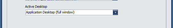
Enabling Desktop with Configuration tool
 |
Enabling Desktop with registry settings
HKLM\Software\HealthCast\ExactAccess\XAServerManager
Desktop: reg_sz = "AppDesktop.clsAppDesktop"
Customizing the Behavior when closing the Desktop
Closing the XA desktop using ALT-F4 or the X button on the window results in the window closing.
To configure your ExactAccess desktop to close (instead of issuing a logoff).
Set the following properties:
HKLM\Software\HealthCast\ExactAccess\Override
LogoffOnDesktopClose: reg_dword = 0
Effects of this setting:
When closing the XA desktop with ALT-F4 or the X button, the window will close. XA will remain running, the user will not be prompted to logoff, the session will remain active. The user may re-display the desktop by double-clicking the XA client icon on the desktop, or right clicking the tray icon and selecting "Show Desktop" from the pop-up menu.
Closing the XA desktop using ALT-F4 or the X button on the window results in initiating a logoff.
To configure your ExactAccess desktop initiate a logoff (instead of just closing).
Set the following properties:
HKLM\Software\HealthCast\ExactAccess\Override
LogoffOnDesktopClose: reg_dword = 1
Effects of this setting:
When closing the XA desktop with ALT-F4 or the X button, the window will close. XA Logoff will be executed, the user will be prompted to logoff.
If the user chooses YES, XA will gracefully close open SSO enabled applications, and will then initiate a Windows logoff to end the session.
If the user chooses NO, logoff will be canceled, and the desktop will be re-displayed.
Configure the NO response of the Prompt for Logoff to re-launch the desktop.
To configure your ExactAccess desktop to re-open when selecting to NOT confirm the logoff.
Set the following properties:
HKLM\Software\HealthCast\ExactAccess\Override
ShowDesktopOnLogoffCancel: reg_dword = 1
Effects of this setting:
When XA is prompting for Logoff Confirmation
If the user chooses YES, XA will gracefully close open SSO enabled applications, and will then initiate a Windows logoff to end the session.
If the user chooses NO, logoff will be canceled, and the desktop will be re-displayed.
Configure the NO response of the Prompt for Logoff to NOT re-launch the desktop.
To configure your ExactAccess desktop to remain closed when selecting to NOT confirm the logoff.
Set the following properties:
HKLM\Software\HealthCast\ExactAccess\Override
ShowDesktopOnLogoffCancel: reg_dword = 0
Effects of this setting:
When XA is prompting for Logoff Confirmation
If the user chooses YES, XA will gracefully close open SSO enabled applications, and will then initiate a Windows logoff to end the session.
If the user chooses NO, logoff will be canceled, the XA desktop will remain closed. The user may re-display the desktop by double-clicking the XA client icon on the desktop, or right clicking the tray icon and selecting "Show Desktop" from the pop-up menu.
Customizing the display
The remaining settings for the visual display of the Application Desktop are in the following file:
c:\program files (x86)\HealthCast\ExactAccess\config.xml
Below are descriptions and settings for each of the XML Nodes contained within the config.xml for setting up the display properties of the application desktop.
Full example config.xml
Example
<Desktops>
<Desktop id="Default" ShowStatus="true" Icon="xasysicon.ico" ForceToSize="true" AllowUserResize="true" StartX="0" StartY="0" Width="800" Height="600">
<BackgroundImage ImageLocation="xa_app_background.bmp" PictureDisplay="none" Color="$FFFFFF"/>
<Links StartX="75" StartY="280" ColumnSize="315" Layout="Vertical" FontFace="Verdana" Size="8" Style="bold" Color="$112233" Selected="$FF1C04" ShowInvalid="False" Underline="false" ShowIconWithLinks="True" IconClickable="False" TightBorders="False" IconSize="32"/>
<Lock StartX="72" StartY="55" ImageLocation="lock.bmp" Color="$800080"/>
<Logoff StartX="120" StartY="55" ImageLocation="logoff.bmp" Color="$FF0080"/>
<UserName StartX="75" StartY="15" FontFace="Verdana" Size="12" Style="bold" Color="$441C04" visible="false"/>
<DSName StartX="10" StartY="115" FontFace="Verdana" Size="12" Style="bold" Color="$441C04" visible="false" />
<Description StartX="10" StartY="115" FontFace="Verdana" Size="12" Style="bold" Color="$441C04" visible="false" />
<FirstName StartX="75" StartY="15" FontFace="Verdana" Size="12" Style="bold" Color="$441C04" visible="false" />
<LastName StartX="75" StartY="15" FontFace="Verdana" Size="12" Style="bold" Color="$441C04" visible="true" />
<Phone StartX="10" StartY="115" FontFace="Verdana" Size="12" Style="bold" Color="$441C04" visible="false" />
<EMail StartX="10" StartY="115" FontFace="Verdana" Size="12" Style="bold" Color="$441C04" visible="false" />
<Address StartX="10" StartY="115" FontFace="Verdana" Size="12" Style="bold" Color="$441C04" visible="false" />
</Desktop>
</Desktops>
Desktops
The desktops node of the XML document is a parent/container node for multiple Desktop nodes. The desktop list will appear as a context menu popup when right clicking on the XA Application Desktop background (not over links).
Desktop
The individual Desktop nodes appear under the main Desktops collection node. Each grouping of settings describes a unique desktop configuration that an end user may choose.
The following settings are part of this node:
id="Default" - this is the "physical" name of the desktop and will appear as a menu item in the context menu.
ShowStatus="true" - this setting indicates if a status bar shows at the bottom of the desktop. The status bar will show physical paths to desktop links.
Icon="xasysicon.ico" - this setting indicates the icon file to use for the system menu of the window.
ForceToSize="true" - this setting indicates if the desktop should be resized to the settings indicated as opposed to allowing Windows® to decide the initial size of a window when the user has not yet chosen a default desktop size.
AllowUserResize="true" - this setting indicates if a user is allowed to change the windows size. Each individual user may have their own preference for window width and height.
StartX="0" - the initial horizontal position of the window - if both the X and Y settings are 0, then the window will appear centered in the Default Monitor screen center.
StartY="0" - the initial vertical position of the window.
Width="800" - the initial width of the window. If the user is allowed to change the height and width, user preferences will override these values.
Height="600" - the initial height of the window. If the user is allowed to change the height and width, user preferences will override these values.
The Desktop settings must be on a single line and contain no line breaks. As this is an XML document, the formatting must appear as shown below.
Example
<Desktop id="Default" ShowStatus="true" Icon="xasysicon.ico" ForceToSize="true" AllowUserResize="true" StartX="0" StartY="0" Width="800" Height="600">
BackgroundImage
The BackgroundImage node is a sub-node of Desktop, and describes the display that links and other information will appear over the top of.
The following settings are part of this node:
ImageLocation="xa_app_background.bmp" - this indicates the file to use to show on the background. Typically, this is only a banner, but can include the full size of the Desktop.
Note
Note that the Links settings will layer on top of the desktop background, so details in the middle of the image may be hidden if the image is the size of the desktop.
PictureDisplay="none" - this setting describes what effect to apply to the image specified. The following settings are supported.
none - no effect will be applied to the image. The image will be positioned in the upper left of the desktop display area. It will not be resized with the desktop.
tile - the image will be duplicated from left to right, top to bottom until the desktop display area is covered. This is convenient when a small pattern is used for the image.
stretch - the image will be sized to fit the desktop display area - small images will be enlarged, and large images will be reduced to fit the display area. This is convenient when the image specified is entered as the same size as the desktop display area. The image will be resized when the desktop is sized by the user.
Color="$AABBCC" - if no image is specified, the background color will be used. Color choices are solid only, no pattern, and are specified in hexadecimal numbers. From left to right, each color range is specified with two digits. Blue (AA), Green (BB), and Red (CC)
Example
<BackgroundImage ImageLocation="xa_app_background.bmp" PictureDisplay="none" Color="$FFFFFF">
Links
The Links node is a sub-node of Desktop, and describes the appearance of application links for applications the user is authorized to start.
The following settings are part of this node:
StartX="75" - the pixel position the links will start from the Left of the desktop.
StartY="280" - the pixel position the links will start from the Top of the desktop.
ColumnSize="315" - the pixel width of a single column. If all of the users' links do not fit in this width, the column will be made wider to accommodate longer text. This setting is useful primarily when link names are short, but the administrator would like to adjust the spacing between the columns.
Layout="Vertical" - the order the links will be displayed in. While they are always alphabetically sorted, they may be sorted from left to right, top to bottom, or top to bottom, left to right.
Vertical - links will be displayed sorted top to bottom, left to right.
Horizontal - links will be displayed sorted left to right, top to bottom.
FontFace="Verdana" - this is the name of the font to use. Ensure that the font chosen is present on the workstation where the configuration is to be deployed.
Size="12" - the point size of the font. This setting does not indicate pixel height or width of the font.
Style="bold" - a comma separated list of styles to apply to the font.
Bold - applies the bold attribute to the font.
Italic - applies the italic attribute to the font.
Color="$112233" - The color of the text specified in hexadecimal numbers. From left to right, each color range is specified with two digits. Blue (11), Green (22), and Red (33)
Selected="$441C04" - The color the link will change to when the user hovers the mouse over it. Indicates this will be the selection if the user clicks the left mouse button to launch the application.
ShowInvalid="False" - When TRUE, indicates to show a link even if it is invalid (the application is not available on the workstation). This is used primarily for developing a desktop layout where the user or the development machine may not have access to the applications that end users will actually have. It allows the developer to configure the desired display given a number of links on the desktop for visual feedback.
Underline="true" - the specific style of underlining to apply to links. Use this if you wish to simulate the way Web page hyperlinks work by displaying clickable links as underlined.
ShowIconWithLinks="True" - When set to TRUE, enables the desktop to display the application icon images to the left of the link.
IconClickable="False" - When TRUE, indicates that the user can click the icon to launch the application.
TightBorders="False" - When TRUE, indicates that the white space around the link is reduced so the user must select the actual link text to launch the application.
IconSize="32" - Changes the icon display size. Supported sizes are 16, 24, 32, 48, and 64. Size is specified in pixels.
ShowLinks="True" - Changes the desktop to show or not the application name as a link on the desktop.
ShowAppNameAsHint="False" - Setting will allow the mouse hover hint to show the full application name (link name) if enabled.
Example
<Links StartX="75" StartY="280" ColumnSize="315" Layout="Vertical" FontFace="Verdana" Size="8" Style="bold" Color="$441C04" Selected="$441C04" ShowInvalid="False" Underline="true" ShowIconWithLinks="True" IconClickable="False" TightBorders="False" IconSize="32" ShowLinks="True" ShowAppNameAsHint="False" />
Warning
Be sure that at least one of the link properties is set to true for Icons (ShowInconWithLinks) or Links (ShowLinks) or the desktop will not be functional to launch applications.
To make icons appear on the XA Application Desktop
You will edit the XA configuration XML file to enable icons to appear on the desktop.
Open the following XML file: C:\Program Files\HealthCast\ExactAccess\config.xml
Locate the following node in the file:
<Links StartX=
At the end of this section, add the following before the closing portion of the tag ( />)
<Links StartX="".... ShowIconWithLinks="True" />
Save the changes you have made in the XML.
Close the XML file.
Change icon sizes on the XA Application Desktop
You will edit the XA configuration XML file to change icon size on the desktop.
Open the following XML file: C:\Program Files\HealthCast\ExactAccess\config.xml
Locate the following node in the file:
<Links StartX=
At the end of this section, add the following before the closing portion of the tag ( />)
<Links StartX="".... IconSize="32" />
The following sizes are supported: 16, 24, 32, 48, 64
Save the changes you have made in the XML.
Close the XML file.
Change link white space on the XA Application Desktop
You will edit the XA configuration XML file to change the link activation area on the desktop.
Open the following XML file: C:\Program Files\HealthCast\ExactAccess\config.xml
Locate the following node in the file:
<Links StartX=
At the end of this section, add the following before the closing portion of the tag ( />)
<Links StartX="".... TightBorders="True" />
Save the changes you have made in the XML.
Close the XML file.
Making icons clickable on the XA Application Desktop
You will edit the XA configuration XML file to enable icon clicking on the desktop.
Open the following XML file: C:\Program Files\HealthCast\ExactAccess\config.xml
Locate the following node in the file:
<Links StartX=
At the end of this section, add the following before the closing portion of the tag ( />)
<Links StartX="".... IconClickable="True" />
Save the changes you have made in the XML.
Close the XML file.
Defining Custom Icons for applications
Associate a specific icon with a specific Connector
After enabling icons with the XA desktop, you may notice that the icons displayed with the Connector do not match the application. The procedure below details how to set a custom icon for each Connector so that the underlying application is accurately represented.
Extract or otherwise create an icon (.ICO) file representing the application.
Name the icon file the same name as the Connector executable and place it in the same directory as the Connector.
This can be done by including the icon as an HCIDeploy item for the Connector
Example:
If the Connector name is xaInvision.exe, name the icon xaInvision.ico and place it in the same directory as xaInvision.exe. After the icon is available in the directory, this icon will override the default Connector icon. Refresh the desktop using the "Refresh Desktop" pop-up menu item on the ExactAccess User Context Manager in the system tray.
Published application instructions for icons
For published applications that use the generic launcher, a slightly different method must be employed. Because the launcher name is always the same, no matter what application is being launched, simply placing a new icon for the launcher will not properly identify the application being launched. Each link on the desktop that references the launcher will be followed by an icon specification.
Example:
xaLauncher.exe "SSO Application" is shown on the status when hovering over the published Application Connector link.
Put the following file (xaApp.ico) in the same directory as xaLauncher.exe
(this will typically beC:\Program Files\HealthCast\ExactAccess)
This file will then override any custom icon (xaLauncher.ico) , and will override the default icon provided in the executable (xaLauncher.exe).
The application launcher for the published "SSO Application" application then needs to be registered with the additional command line parameter "/ICON:xaApp.ico"
Published application instructions for icons when using Citrix PNAgent
For published applications that directly use the PNAgent.exe, a slightly different method must be employed. Because the application name is always the same (pnagent.exe), no matter what application is being launched, and due to permission restrictions on the Citrix PNAgent directory, simply placing a new icon in the PNAgent directory is not an option. As with the launcher, each link on the desktop that references PNAgent will be followed by a an icon specification. However, the default location of the icon must be specified.
Example:
PNAgent.exe /QLaunch "SSO Application" is shown on the status when hovering over the published Application link.
Put the following file (xaApp.ico) in the ExactAccess Directory
(this will typically beC:\Program Files\HealthCast\ExactAccess)
This file will then override any custom icon (PNAgent.ico) , and will override the default icon provided in the executable (PNAgent.exe).
The application launcher for the published "SSO Application" application then needs to be registered with the additional command line parameter "/ICON:%XAUCM%xaApp.ico"
The path to the icon may be specified by using environment variables (specified between the % symbols), or may use the special %XAUCM% designation to mean the XA install path.
Note
See the Application Registration section of the Administrator Tool Guide for information on how to register a Connector.
See Specifying Command Line Parameters for information on how to modify the registration XML file to include command line parameters
Lock
The Lock node is a sub-node of Desktop, and describes the display for the Lock feature. The display for lock can be graphical or text.
The following settings are part of this node:
StartX="75" - the pixel position the Lock button will start from the Left side of the desktop.
StartY="280" - the pixel position the Lock button will start from the Top of the desktop.
Note
The size of the button is dependent on the size of the image specified, or the size of the font when displaying the button.
ImageLocation="lock.bmp" - this indicates the file to use to show the Lock Button.
Color="$112233" - The color of the text specified in hexadecimal numbers. Text is only used when no image is specified. From left to right, each color range is specified with two digits. Blue (11), Green (22), and Red (33)
Example
<Lock StartX="72" StartY="55" ImageLocation="lock.bmp" Color="$800080"/>
UserName
The UserName node is a sub-node of Desktop, and describes the display for showing user information.
The following settings are part of this node:
StartX="75" - the pixel position the user information will start from the Left side of the desktop.
StartY="280" - the pixel position the user information will start from the Top of the desktop.
FontFace="Verdana" - this is the name of the font to use. Ensure that the font chosen is present on the workstation where the configuration is to be deployed.
Size="12" - the point size of the font. This setting does not indicate pixel height or width of the font.
Style="bold" - a comma separated list of styles to apply to the font.
Bold - applies the bold attribute to the font.
Italic - applies the italic attribute to the font.
Color="$112233" - The color of the text specified in hexadecimal numbers. From left to right, each color range is specified with two digits. Blue (11), Green (22), and Red (33)
Visible="false" - This specifies to display or not display this piece of user information.
Note
The UserName field is in domain/username form when connected to ExactAccess servers configured for Active Directory.
Example
<UserName StartX="75" StartY="15" FontFace="Verdana" Size="12" Style="bold" Color="$112233" visible="false"/>
DSName
The DSName node is a sub-node of Desktop, and describes the display for showing user information.
The following settings are part of this node:
StartX="75" - the pixel position the user information will start from the Left side of the desktop.
StartY="280" - the pixel position the user information will start from the Top of the desktop.
FontFace="Verdana" - this is the name of the font to use. Ensure that the font chosen is present on the workstation where the configuration is to be deployed.
Size="12" - the point size of the font. This setting does not indicate pixel height or width of the font.
Style="bold" - a comma separated list of styles to apply to the font.
Bold - applies the bold attribute to the font.
Italic - applies the italic attribute to the font.
Color="$112233" - The color of the text specified in hexadecimal numbers. From left to right, each color range is specified with two digits. Blue (11), Green (22), and Red (33)
Visible="false" - This specifies to display or not display this piece of user information.
Note
The DSName field is in domain/username form when connected to ExactAccess servers configured for Active Directory.
Example
<DSName StartX="10" StartY="115" FontFace="Verdana" Size="12" Style="bold" Color="$441C04" visible="false"/>
Description
The UserName node is a sub-node of Desktop, and describes the display for showing user information.
The following settings are part of this node:
StartX="75" - the pixel position the user information will start from the Left side of the desktop.
StartY="280" - the pixel position the user information will start from the Top of the desktop.
FontFace="Verdana" - this is the name of the font to use. Ensure that the font chosen is present on the workstation where the configuration is to be deployed.
Size="12" - the point size of the font. This setting does not indicate pixel height or width of the font.
Style="bold" - a comma separated list of styles to apply to the font.
Bold - applies the bold attribute to the font.
Italic - applies the italic attribute to the font.
Color="$112233" - The color of the text specified in hexadecimal numbers. From left to right, each color range is specified with two digits. Blue (11), Green (22), and Red (33)
Visible="false" - This specifies to display or not display this piece of user information.
Note
The Description field may not contain data.
Example
<Description StartX="10" StartY="115" FontFace="Verdana" Size="12" Style="bold" Color="$441C04" visible="false"/>
FirstName
The FirstName node is a sub-node of Desktop, and describes the display for showing user information.
The following settings are part of this node:
StartX="75" - the pixel position the user information will start from the Left side of the desktop.
StartY="280" - the pixel position the user information will start from the Top of the desktop.
FontFace="Verdana" - this is the name of the font to use. Ensure that the font chosen is present on the workstation where the configuration is to be deployed.
Size="12" - the point size of the font. This setting does not indicate pixel height or width of the font.
Style="bold" - a comma separated list of styles to apply to the font.
Bold - applies the bold attribute to the font.
Italic - applies the italic attribute to the font.
Color="$112233" - The color of the text specified in hexadecimal numbers. From left to right, each color range is specified with two digits. Blue (11), Green (22), and Red (33)
Visible="false" - This specifies to display or not display this piece of user information.
Note
The FirstName field will be empty when connected to ExactAccess Servers configured for Active Directory (WINNT provider) - use Last Name to display the users FULL NAME.
Example
<FirstName StartX="75" StartY="15" FontFace="Verdana" Size="12" Style="bold" Color="$441C04" visible="false"/>
LastName
The LastName node is a sub-node of Desktop, and describes the display for showing user information.
The following settings are part of this node:
StartX="75" - the pixel position the user information will start from the Left side of the desktop.
StartY="280" - the pixel position the user information will start from the Top of the desktop.
FontFace="Verdana" - this is the name of the font to use. Ensure that the font chosen is present on the workstation where the configuration is to be deployed.
Size="12" - the point size of the font. This setting does not indicate pixel height or width of the font.
Style="bold" - a comma separated list of styles to apply to the font.
Bold - applies the bold attribute to the font.
Italic - applies the italic attribute to the font.
Color="$112233" - The color of the text specified in hexadecimal numbers. From left to right, each color range is specified with two digits. Blue (11), Green (22), and Red (33)
Visible="false" - This specifies to display or not display this piece of user information.
Note
The LastName field will contain the user's FULL NAME when connected to ExactAccess servers configured for Active Directory when using the "Use Display Name field" option, and will contain the last name as provide by the SN attribute when configured for "Use Given Name (First Name) and SN (Last name) fields" option
Example
<LastName StartX="75" StartY="15" FontFace="Verdana" Size="12" Style="bold" Color="$441C04" visible="true"/>
Phone
The Phone node is a sub-node of Desktop, and describes the display for showing user information.
The following settings are part of this node:
StartX="75" - the pixel position the user information will start from the Left side of the desktop.
StartY="280" - the pixel position the user information will start from the Top of the desktop.
FontFace="Verdana" - this is the name of the font to use. Ensure that the font chosen is present on the workstation where the configuration is to be deployed.
Size="12" - the point size of the font. This setting does not indicate pixel height or width of the font.
Style="bold" - a comma separated list of styles to apply to the font.
Bold - applies the bold attribute to the font.
Italic - applies the italic attribute to the font.
Color="$112233" - The color of the text specified in hexadecimal numbers. From left to right, each color range is specified with two digits. Blue (11), Green (22), and Red (33)
Visible="false" - This specifies to display or not display this piece of user information.
Note
The Phone field may not contain data.
Example
<Phone StartX="10" StartY="115" FontFace="Verdana" Size="12" Style="bold" Color="$441C04" visible="false"/>
The EMail node is a sub-node of Desktop, and describes the display for showing user information.
The following settings are part of this node:
StartX="75" - the pixel position the user information will start from the Left side of the desktop.
StartY="280" - the pixel position the user information will start from the Top of the desktop.
FontFace="Verdana" - this is the name of the font to use. Ensure that the font chosen is present on the workstation where the configuration is to be deployed.
Size="12" - the point size of the font. This setting does not indicate pixel height or width of the font.
Style="bold" - a comma separated list of styles to apply to the font.
Bold - applies the bold attribute to the font.
Italic - applies the italic attribute to the font.
Color="$112233" - The color of the text specified in hexadecimal numbers. From left to right, each color range is specified with two digits. Blue (11), Green (22), and Red (33)
Visible="false" - This specifies to display or not display this piece of user information.
Note
The EMail field may not contain data.
Example
<EMail StartX="10" StartY="115" FontFace="Verdana" Size="12" Style="bold" Color="$441C04" visible="false"/>
Address
The Address node is a sub-node of Desktop, and describes the display for showing user information.
The following settings are part of this node:
StartX="75" - the pixel position the user information will start from the Left side of the desktop.
StartY="280" - the pixel position the user information will start from the Top of the desktop.
FontFace="Verdana" - this is the name of the font to use. Ensure that the font chosen is present on the workstation where the configuration is to be deployed.
Size="12" - the point size of the font. This setting does not indicate pixel height or width of the font.
Style="bold" - a comma separated list of styles to apply to the font.
Bold - applies the bold attribute to the font.
Italic - applies the italic attribute to the font.
Color="$112233" - The color of the text specified in hexadecimal numbers. From left to right, each color range is specified with two digits. Blue (11), Green (22), and Red (33)
Visible="false" - This specifies to display or not display this piece of user information.
Note
The Address field may not contain data.
Example
<Address StartX="10" StartY="115" FontFace="Verdana" Size="12" Style="bold" Color="$441C04" visible="false"/>